As Red And Blue Debate, Green Printer And Orange Coin Always Win
The nation and world are on the brink, awaiting official Electoral College votes to be cast on December 14, despite convincing conjectural consensus on the champion. But either way, 2020’s highly-contested U.S. presidential election reminds us that much of the country is either rabidly red or batty blue. This has resulted in a magnitude of red vs. blue conflict the likes of which we have rarely seen before.
The purported stark contrasts between both sides, however, ring empty in regards to the monetary policies these two parties employ. Especially so over the previous five decades, while they swapped control over the executive branch of the United States. These staunchly disputed differences of position appear to be shallow and essentially meaningless — with both sides hardly commentating, let alone differentiating, on monetary policy.
The Federal Reserve supposedly maintains its political independence, however the data suggests that the private legalized monetary cartel has in fact been influenced by the Oval Office and U.S. Treasury, depending on the general direction of the controlling regime. As such, decisions from the Executive Office of the United States of America have major implications on the integrity of the United States dollar.
We can possibly glean some insight from historical presidential precedence by composing volumetric evidence of what these two political parties have done historically at the helm of the monetary printing presses. This political printing analysis is important and applicable today, given the sheer volume of monetary expansion that has been and is still occurring. It is also especially important in regard to Bitcoin because either Donald J. Trump or Joseph R. Biden have been in the office of president or vice president since January 20, 2009, just days after the Bitcoin network Genesis Block on January 3, 2009.
M1 And M2
Money may be the root of all evil, but what is it made of? The composition of money in the United States is a complex, obfuscated tale of deposits, notes, checks, credit, bills and various other IOUs, both physical and digital. The physical composition of the paper money of the United States, however, is a simpler tale: 75 percent cotton and 25 percent linen.
Common measures of the U.S. monetary supply used by the United States Federal Reserve are M1 and M2. Straight from the horse’s mouth, here is the definition for the M1 data set:
M1:
M1 includes funds that are readily accessible for spending. M1 consists of: (1) currency outside the U.S. Treasury, Federal Reserve Banks, and the vaults of depository institutions; (2) traveler’s checks of nonbank issuers; (3) demand deposits; and (4) other checkable deposits (OCDs), which consist primarily of negotiable order of withdrawal (NOW) accounts at depository institutions and credit union share draft accounts. Seasonally adjusted M1 is calculated by summing currency, traveler’s checks, demand deposits, and OCDs, each seasonally adjusted separately.
–Citation: Board of Governors of the Federal Reserve System (US), M1 Money Stock [M1], retrieved from FRED, Federal Reserve Bank of St. Louis; https://fred.stlouisfed.org/series/M1, November 10, 2020.
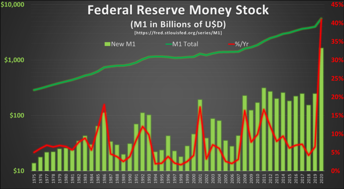
In 2020 alone, Team Red, the Fed and the Trump administration oversaw the growth of M1 money supply by $1.628 trillion, eclipsing total M1 in circulation in 2009 ($1.612 trillion) when President Obama first took office. In 2020 M1 increased by 40.96 percent to $5.6 trillion.
M2:
M2 includes M1 and some other monetary instruments. According to the Fed, the M2 data set is:
M2 includes a broader set of financial assets held principally by households. M2 consists of M1 plus: (1) savings deposits (which include money market deposit accounts, or MMDAs); (2) small-denomination time deposits (time deposits in amounts of less than $100,000); and (3) balances in retail money market mutual funds (MMMFs). Seasonally adjusted M2 is computed by summing savings deposits, small-denomination time deposits, and retail MMMFs, each seasonally adjusted separately, and adding this result to seasonally adjusted M1.
–Citation: Board of Governors of the Federal Reserve System (US), M2 Money Stock [M2], retrieved from FRED, Federal Reserve Bank of St. Louis; https://fred.stlouisfed.org/series/M2, November 10, 2020.
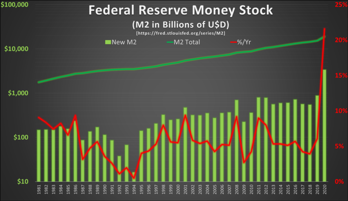
Similar to the massive increases in M1, 2020 saw the growth of M2 Money Stock by $3.320 trillion, as of October 26. Over the last four years of the Trump administration, M2 increased by 40.30 percent to $18.839 trillion
For further analysis, M1 and M2 will be the metrics we use to attempt to benchmark previous presidential administrations in regards to monetary policy going back to 1981 (M2 data) and 1974 (M1 data).
Does Blue Or Red Printer BRRR More Green?
So, in the great struggle between red and blue, it is important to understand which party has historically been more friendly to the activity of the monetary printing presses. Let us start with M1.
M1:
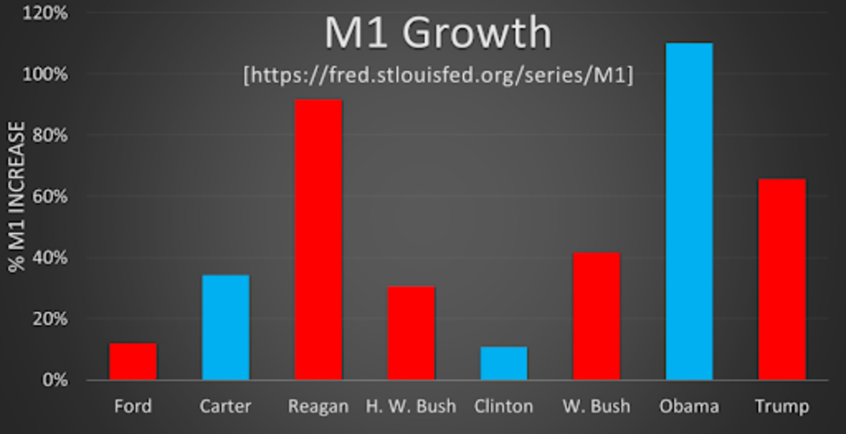
The trend is stark: the M1 monetary supply of the United States is growing at an alarmingly accelerating rate. Each American administration since Richard Nixon’s has overseen the expansion of the money supply, some more aggressively than others.
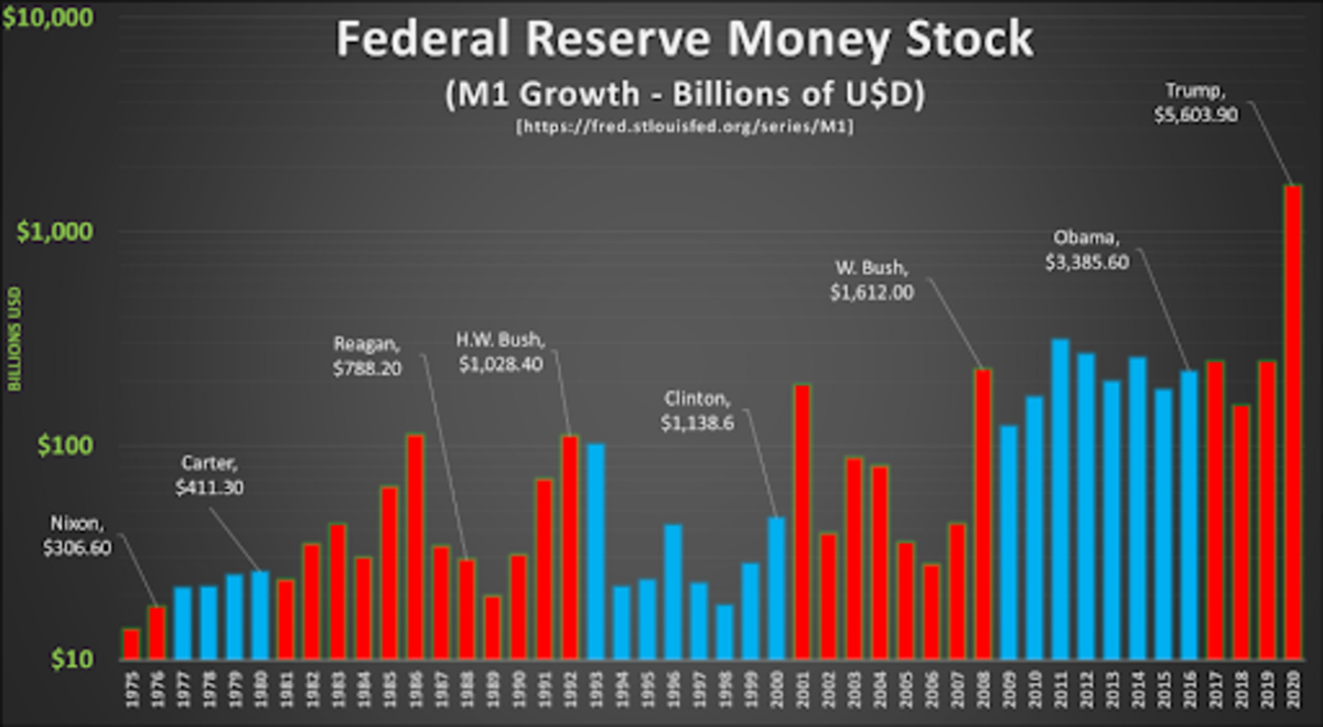
For example, by 2015 the Obama administration had overseen the expansion of M1 by an additional $1.729 trillion, more than was originally in circulation when he took office in 2009. A clean doubling of the M1 money supply, in just over six years.
Likewise, in 2020 alone, the Fed and the Trump administration grew the USD M1 monetary supply by $1.628 trillion, eclipsing total 2009 M1 in circulation ($1.612 trillion) when President Obama first took office. However, in terms of percentage, these M1 growth numbers look slightly different. The Obama and Reagan administrations hold the respective Blue and Red Team MVP awards in percentage increases, surprisingly.
In 2020, M1 increased 40.96 percent year-over-year to $5.6 trillion. You read that correctly: In a single year, Trump grew the M1 money supply an equivalent amount that took the historically pro-printer, banker-friendly Obama administration more than six years! Likewise, Obama in a single year (201 1, $310 billion) increased M1 an amount that took George W. Bush four years to accomplish.
Interestingly enough, despite this, Team Red as a whole has issued more USD M1 than the typically more fiscally liberally Team Blue over the previous 46 years. This may be due to the fact that Team Red held the presidency for six more years than Team Blue, so let’s try and normalize it.
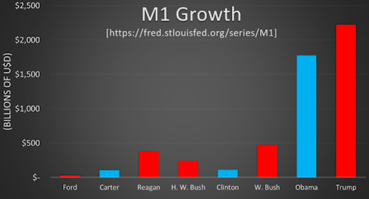
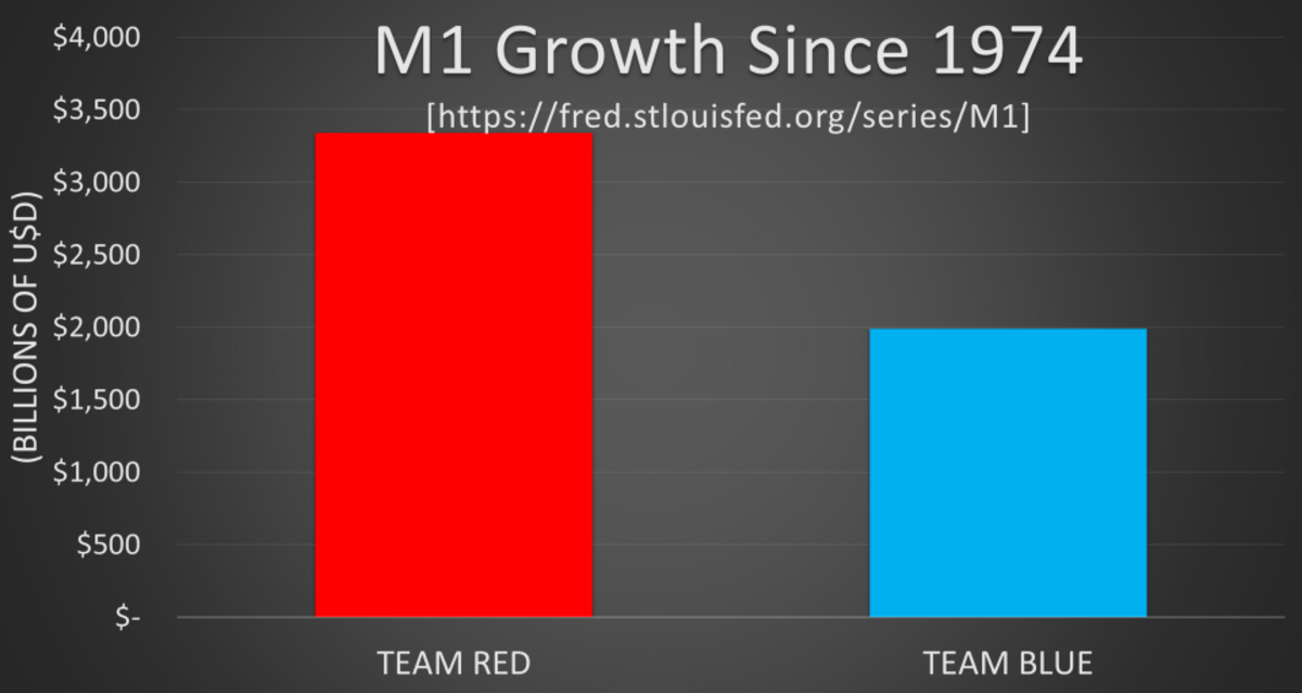
Team Blue grew M1 by roughly $2 trillion during three separate administrations over 20 presidential years since 1974 , an average rate of $100 billion per year.
Team Red expanded M1 by $3.3 trillion during five different administrations over 26 presidential years since 1974 , an average rate of $128 billion per year. Team Red prints volumetrically more and at a 29 percent quicker rate per year.
Interestingly enough, if the Trump administration’s four years of excessive printing were removed from the above analysis, Team Blue would have out-printed Team Red at about twice the rate. However, the historical evidence is clear, neither party or team is a stranger to the monetary printing presses. It would appear that regardless of which team currently holds the presidency of the United States, the money printers have roared.
M2:
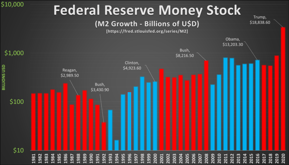
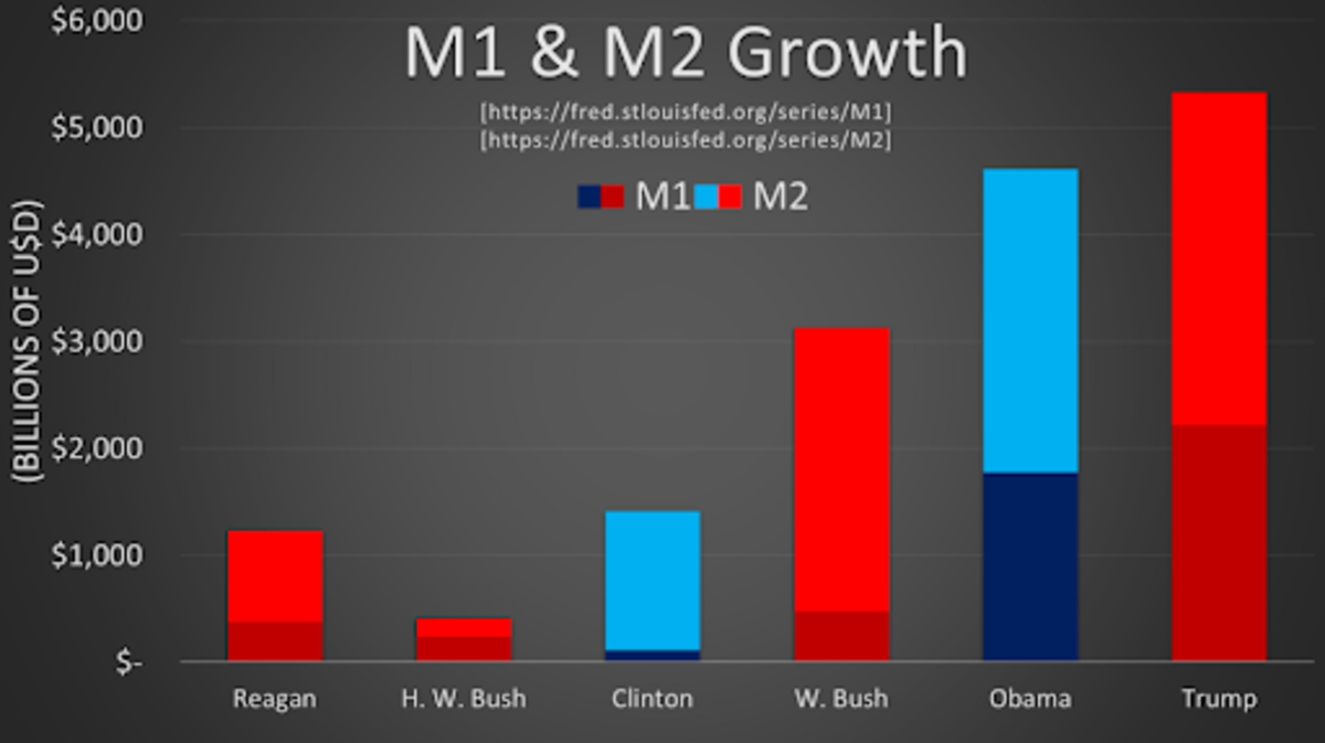
We will do this analysis again, except we will study the amount of M2 growth per year while visualizing each year by team of the administration that oversaw that expansion. The chart below also attributes the total amount of M2 circulating at the end of each presidency.
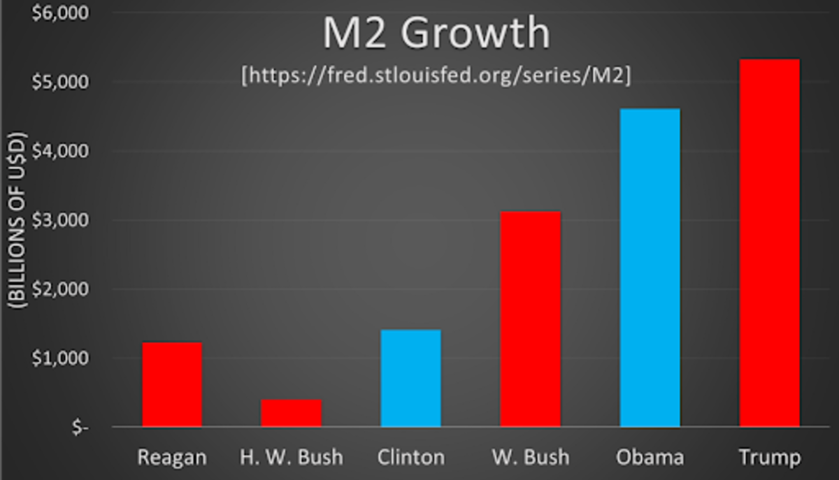
The trend is unfortunately again clear, the monetary policies of each successive president sees the expansion of the M2 money supply more than the last. There is one exception though: it would appear that George H.W. Bush printed the least amount of money and bucked the trend.
A shocking stat from the by-presidency analysis of M2 expansion: The Trump administration oversaw 13-times the growth of M2 as the first Bush administration. However, in relative values, these M2 growth values compare differently. Bush, in terms of percentage actually grew M2 the most.
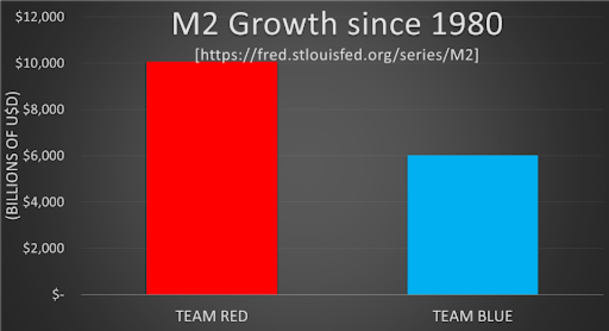
Again, Team Red oversaw more growth of USD M2 than the stereotypically more fiscally liberal Team Blue over the previous 40 years. However, this is not as surprising, because a major component of M2 is M1.
The Democrats and Team Blue grew M2 by roughly $6 trillion during two separate administrations over 16 presidential years since 1980 , an average rate of $376 billion per year.
The Republicans and Team Red expanded M2 by $10 trillion during four different administrations over 24 presidential years since 1980, an average rate of $420 billion per year. Team Red prints more M2 and at about a 12 percent quicker rate per year.
Both M2 and the portion of M1 embedded in the money supply increases by presidency is displayed in the chart below:
The data from M1 and M2 expansion is clear, while each side of this current political conflict prints more here or there depending on how it is measured, the general tendency is painfully obvious: the monetary differences of each major American political party have been negligible over the past few generations. The American public at large appears to be caught up in a Fiscal Illusion.
Implications For Bitcoin
As the M1 and M2 money supply measures continue their pace upwards, the “printing presses” will continue to stream dollars from the Fed into every nook and cranny of the economy and world, all in the name of maximum employment and stable prices. These newly-created dollars are seeking refuge wherever they can retain value. Asset inflation and real inflation are now widely recognized as completely decoupled from typical goods and services inflation, which is often represented as the heavily manipulated CPI (consumer price index).
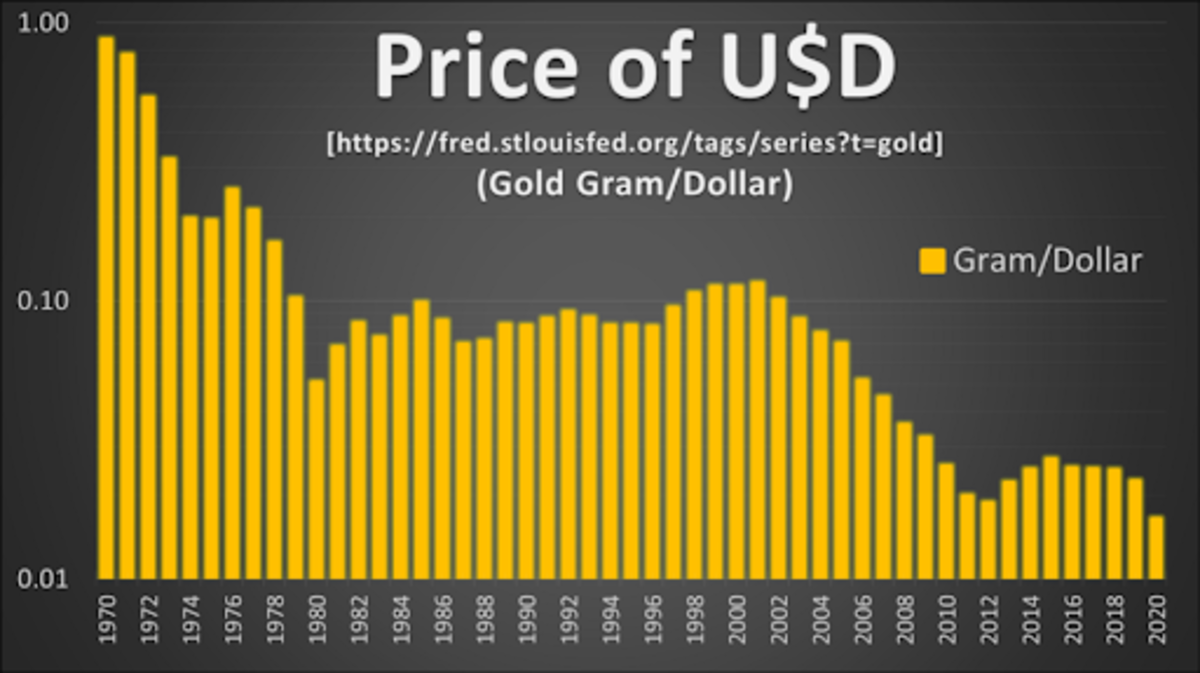
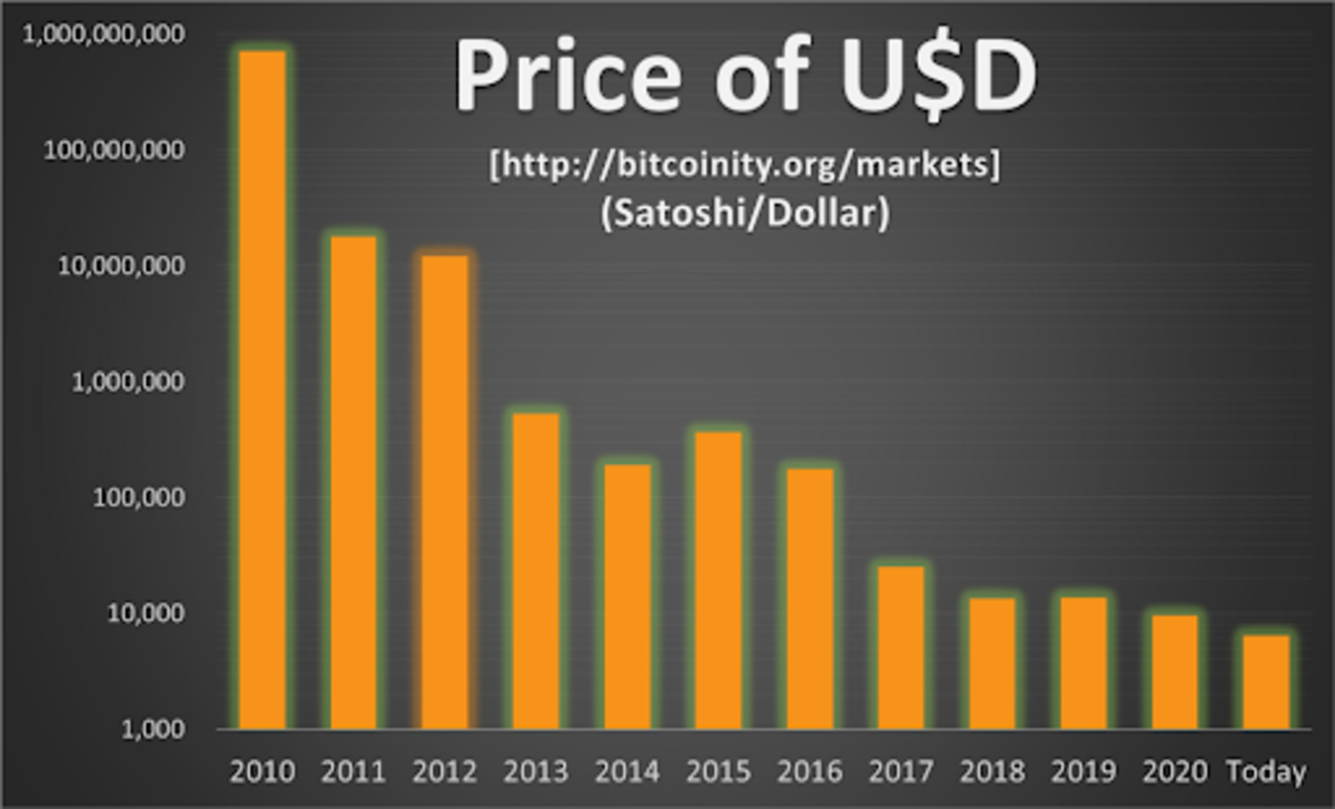
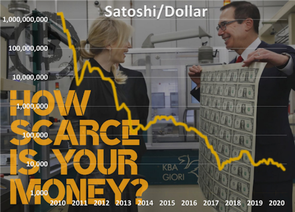
Simple supply-and-demand theory explains why the market price of dollars is dropping against scarcer goods such as gold and bitcoin: because the money supply (M1 and M2) is aggressively increasing.
These steep downward dollar price trends against gold (over 50-plus years) and bitcoin (over 10-plus years) align nicely with supply increases of the USD seen in the M1 and M2 data sets. This value and supply alignment also corresponds well with the Quantity Theory of Money, originally put forward by Nicolaus Copernicus in 1517. His “Quantity Theory of Money” states that the general price level of goods and services is directly proportional to the amount of money in circulation, or money supply. Other monetary theories to explore and study on this topic include:
- Gresham’s Law : “Bad money drives out good”
- Veil of Money : “Commoditization of money”
- Money Illusion : “Time value of money is misunderstood”
- Neutrality of Money : “Money supply and demand”
The data and trends are as clear as can be: Irrespective of who comes out ahead in the vote tally, the results of the Electoral College or even who holds the high office of the presidency, the money supply in the United States will likely continue to increase. The Red vs. Blue Team hysteria that we are seeing, with regards to differentiating monetary policy in America, is baseless.
The dynamics of how easy money interacting with hard money will continue to play out over this presidential term, just as they have in all of the previous terms since President Nixon and his “Nixon Shock.” Projected Winners: Green Printer, Orange Coin.
This is a guest post by Tyler Bain. Opinions expressed are entirely his own and do not necessarily reflect those of BTC Inc or Bitcoin Magazine.
The post As Red And Blue Debate, Green Printer And Orange Coin Always Win appeared first on Bitcoin Magazine.
from Bitcoin Magazine https://ift.tt/3nuhDHj


No comments